
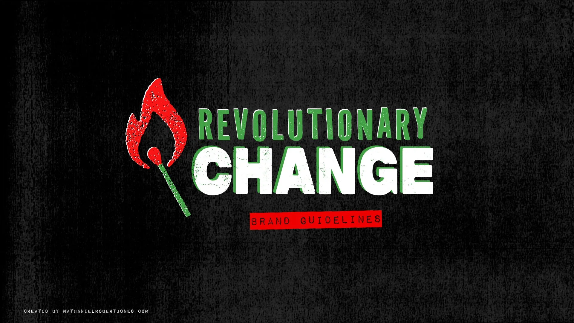
Revolutionary Change
I am always eager to work with clients who share my political values, so I leapt at the opportunity to completely overhaul the branding of JENerational Change—a progressive YouTube channel hosted by Jen Perelman and Peter Hager. Prior to the rebrand, the YouTube channel had repurposed the branding used for Jen’s previous campaign for election to the US House to represent Florida's 25th Congressional District. While that branding was appropriate for when they first started out, the hosts were ready to take the channel in a more overtly “radical” direction, starting with changing the name to Revolutionary Change.
(Example of previous branding)
On their YouTube channel, Jen and Peter discuss the issues that are critical regarding their mission of creating a world consistent with social, economic, criminal, and environmental justice. In doing so, they speak with activists, journalists, professors, and other subject matter experts in an effort to educate and inspire people to demand Revolutionary Change now. To reflect this urgency, they had a desire to lean into more overtly “revolutionary” and “radical” aesthetics.
After meeting with Jen and Peter, gathering inspiration, and creating and sharing mood boards, I developed several different design directions for them to respond to. Ultimately, we decided to adopt the colors of the Palestinian flag, and combined various elements from the different directions, and I am very proud of the results!
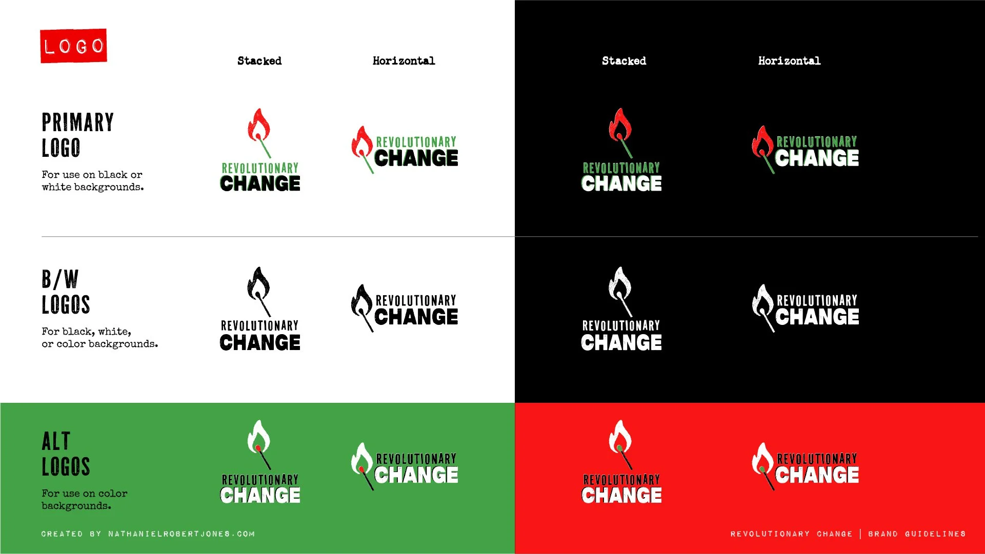
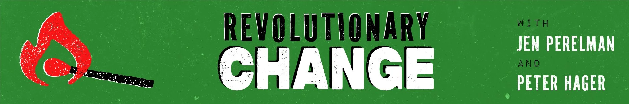
Once we had landed on the new logo and branding, I created a Brand Guidelines document for them, so that any designer they work with in the future has the information they need to design within the system we developed. I also created and delivered new creative assets for their YouTube page, like the banner and avatar images.
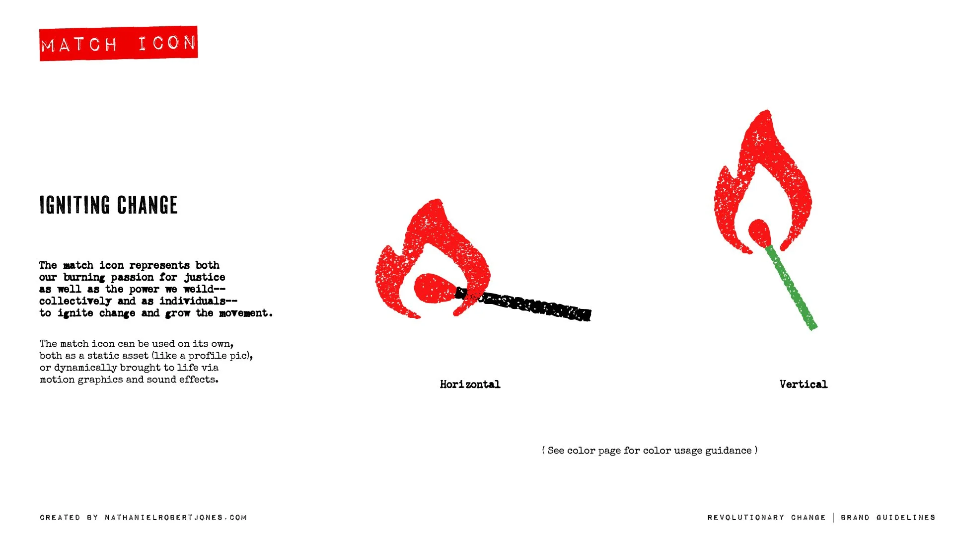


All that was left to complete before launching the new branding, was to update the animated intro that opens each of their videos. Jen already had an audio track in mind and the idea to use the match icon somehow, so I anchored the animation around that song, and attempted to bring to life the “radical” and gritty aesthetic—mimicking paint-roller, spray painted, and stenciled graffiti. The match, struck and lit from the logo itself, represents the burning passion for justice, as well as the power we wield collectively and as individuals—to ignite change and grow the movement.
To celebrate the launch of the rebrand, we created an updated T-shirt design to sell from their integrated YouTube store, with 100% of the profits going to a Palestinian charity.

After the launch of the new branding, Jen approached me with the idea to bring the “Rage-O-Meter” graphic to life as an on-screen animation, and I was more than happy to help. I had a lot of fun with this one, and look forward to more creative collaborations together in the future.